Monday, 1 December 2008

Music Magazine Research


The main task is to create a music magazine cover, contents page and double page spread.

I will begin to get ideas for my own product by reasearching popular music magazines and genres and then from this I will decide a music genre for my own magazine.

The main popular music magazines are:

*NME
*Q
*Mojo
*Kerrang
*Rolling Stone
*Rocksound
*The word
*Mix mag

Most of these magazines are based on the rock/metal/indie music genre.

Well known music genres are:


Black Metal
Blues
Classical
Country
Dancehall
Reggae
Death Metal
Disco
Drum and Bass
Electro
Folk
Funk
Garage
Gothic
Hardcore
House
Jazz
Latin
Metal
Opera
Progressive Rock
Punk
R&B
Hip-Hop
Pop
Salsa
Ska
Techno
Rave
Alternatives
Rock
Ballad
Dance
Trance
Ibiza trance
Club
Streetbeat

LIAAR

I will use LIIAR to start to plan what ideas and decisions I need to create my music magazine:


Language: The language of my music magazine should be entertaining and fun as, no matter who the magazine is aimed at, these qualities will appeal to them. Most magazines use informal language but if my magazine was aimed at music professionals e.g. recording studio managers e.t.c it could be formal. The language and lexis used are all based on who the magazine is aimed at. Common music magazines such as NME and Rolling Stones use informal language and address the reader.

Institution: The institution of my magazine will be the publisher. I will research different common publishers of common magazines e.g: PCM, Emap, Future, IPC...

Ideology: The purpose of my magazine is to entertain and inform the audience about the particular genre of music my magazine is about. I will include articles, interviews and gossip about relevant bands/artists.

Audience: Each magazine has a different target audience and their magazine is created with their target audience in mind. When I choose a music genre I should have the target audience in mind as these are the people who are going to be buyingand reading the magazine.

Representation: The magazine will represent the genre of music the magazine is based around. It should reflect the music in a positive way and advertise appropiate bands/artists. E.g. Kerrang magazine represents rock and Mixmag magazine represents dance music.

Evaluation

In what ways does your Media product use, develop or challenge forms and conventions of real Media products?

My magazine cover uses conventions used in real media products such as plugs, mastheads e.t.c. My magazine cover looks like a real media product as I spent time studying real magazine covers and using the conventions in my own work making it look as realistic as possible. My product doesn’t challenge the forms or conventions of real media products as it is structured and looks like a normal magazine.

How does your media product represent particular social groups?

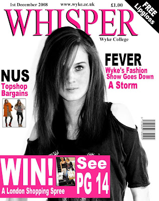
My media product is representing college students as there is a student on the front of each cover and it also says ‘Wyke college magazine’ but categorising them into two different groups: male and female. The male part of the magazine includes stories about rugby and NUS sports deals and the female part of the magazine includes stories about a fashion show and fashion tips. The male cover text e.t.c. is in blue and the female in pink. This is stereotypical of males and females but this is common in media, especially magazines.

What kind of media institution might distribute your media product and why?

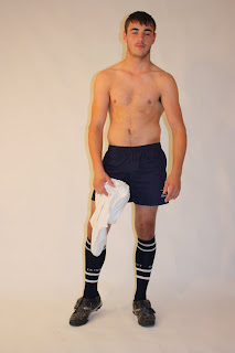
The male part of my magazine is based on a sports type magazine as it includes stories about rugby, deals on sports items and there is a photograph of a rugby player. This is because playing sports is stereotypical of males and doing this shows clearly that that part of the magazine is aimed at the male students. The female part of my magazine is based on modern gossip magazines such as ‘Closer’. The magazine includes stories about a fashion show, Topshop deals and there is an image of a trendy female. This is because fashion and shopping is stereotypical of females and this shows clearly that that part of the magazine is aimed at the female students.

Who would be the audience for your media product?

The audience for my media product would be college students, the male part obviously aimed at males the female obviously aimed at females.

How did you attract/address your audience?

I attracted my audience by using bright, stereotypical colours for the fonts on the magazine covers and using professional looking photographs of attractive students for the main images. I have created the magazine covers to look bright and interesting but also realistic and smart so as to attract the reader. I address the reader as any other magazine would as this will attract the reader as they will be used to other magazines doing this.

What have you learnt about technologies from the process of constructing this product?

I have learnt that making the magazine look as realistic as possible will grab the audience’s attention as it will look attractive and professional. I have also learnt that stereotyping is a good use in media.

Looking back at the preliminary task what do you feel you have learnt in the progression from it to the full product?

When I first heard what the task was I was excited as I enjoy creating things and I knew I would enjoy making a magazine cover. I think I am good at using the program Ulead Photo Express and I also enjoy it so I think this pays off in my work. I have learnt that to make your work look its best you have to spend a lot of time changing little things such as fonts and image sizes and borders. They are only little changes to make but they pay off a lot in the end result as they make your work look better if you spend the time changing things.

Contents Page


Final Cover ( Female )


Photographs


Sunday, 23 November 2008

Final Cover


Choosing the photograph


I have a problem as to which photograph to choose for the front cover of the magazine ( male side .)


I have edited two images and can't decide which looks the best. However, I think it would be best to go with the one with the arms folded as it looks more 'manly' and the model looks quite stubborn and challenging, as if he is challenging the opposite team.

Photographs


Monday, 17 November 2008

Monday, 3 November 2008

Title Of The Magazine

Here I will brainstorm titles for my magazine:

Male Half
Mash
Offside
Banter/Banta
Bring it/Bring
Game
Union
Score
Cheer
Loop
Boot
Kick
Female Half
Dap
Moded
Mod
Empire
Swish
Slick
Hip
Sleek
In
Whisper
Swank

Analysis Of Three Magazines

Here I will analyse three magazines aimed at teenagers and possibly use the conventions of these in my own work.

The main photograph is of a man which obviously goes with the magazine title, ‘Men’s Health’. He is wearing a simple but smart black top and smart jeans and the background of the image is mainly white but in the corner there is a palm tree in a dark brown colour and to the bottom right there is the image of the sea also a dark brown colour. His is obviously well built as his arms look strong. He is possibly an idol of what men want to look like as the text around him says things like ‘Get back in shape’ and ‘Hard Abs’ and ‘your best body ever’. The title of the magazine is orange which stands out. The other text is either in blue or black or a faint red which stand out but not as much as the title. All the titles of the inside stories are to do with health, which is what the magazine is mainly about. All font is bold so it stands out and the colours are 'manly' e.g. blue and so this emphasises the fact that the magazine is aimed at males. The title makes it obvious it is aimed at men as it is in the title. Teenagers will also buy this magazine though as they want to look good and look like ‘men’. There is no text about any stories that are aimed at females which also shows it is a magazine aimed at males.


Analysis Of Three Magazines


The main photograph is of Hilary Duff, a popular celebrity in her teens. This is relevant to the fact that the magazine is aimed at teenagers. She is obviously posing for the photograph as she is smiling and looking straight at the camera. She is visually attractive and her skin has been airbrushed and make-up is applied carefully to make her look her best. Her make-up also goes with the pink font used on the title of the magazine (sugar) and other text e.g. ‘style steals’ as she has pink lip gloss on. The background of the image is neutral (white) and is obviously a studio background. The colour scheme is pink, black, white and yellow which are colours that stand out. Yellow is used as a background with pink and black font over it to make the text stand out and black is used with yellow text over it to also make this stand out. Smaller images are used to show information of the inside stories e.g. the photographs of clothes and the photograph of a female model. The colours of the magazine give off a young, hip feel which is relevant as the magazine is aimed at teenagers, especially girls-shown by the pink font and content in the magazine e.g. girl's fashion. The title of the magazine, 'sugar', is short and catchy and emphasises the fact that the magazine is for girls as sweet things are usually associated with females. There are also no images of, or to do with, males on the cover which also shows the magazine is aimed at females.

Analysis Of Three Magazines


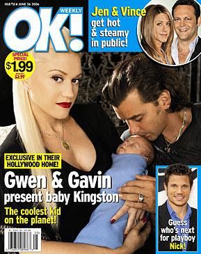
The main photograph is of two celebrities (Gwen Stefani and her husband Gavin) holding their new baby son. They are posing for the photograph as Gwen is holding the baby and looking straight at the camera and her husband is kissing the baby’s forehead. Gwen’s skin is airbrushed and she is wearing thick makeup which shows that the photograph has been deliberately taken at a photoshoot. Gwen and Gavin are wearing dark colours which go with the background which is also dark. The colours give off a classy, homely feel. The baby is wrapped in a blue blanket which is stereotypical for a baby boy. The logo of the magazine is placed to the far left above Gwen’s head so it is noticeable. The logo is white and blue which are linked with the baby’s blanket. The borders and backgrounds on the other smaller images are also a baby blue which link with the baby’s blanket. This is emphasising that the main story is about a new born baby boy. The only font colours used on the cover are yellow, white and baby blue which all stand out. The yellow is used to emphasis names and statements e.g. ‘Nick’ and ‘The coolest kid on the planet’ The yellow is also used as a background of other bits of text to emphasise them e.g. ‘Exclusive in their Hollywood home!’ The main story is made clear as it is written in large white font across the main image so you notice it straight away.


Cover Draft

I have created a draft of what my final piece (magazine cover) could look like. I have used the conventions of other teen magazines.

Title (masthead): This is at the top of the cover and should be a bold, bright font as to stand out to the reader as they will immediately recognise the magazine they are reading. It should look attractive and not boring to attract people to read the magazine.

Plugs: These should be in quite a bold font as to stand out to the reader. They could be used to advertise college trips, college parties (e.g. the Halloween party) and equipment on sale e.g. the college sports jumpers. It could also be used to advertise competitions the college is holding. Some of the plugs could include an image e.g. if it is advertising a college trip an image of the place e.g. the Eiffel tower if it is Paris.

Headings Of Inside Content: These should also be bold to stand out to the public and are used to persuade the people to read the magazine. Most magazines use words such as 'Shocking' and 'Fantastic' to persuade the public to read the magazine. They should use persuasive words but should also be relevant to the college.

Photograph Plan: The main photograph is going to be of two students, one male one female. I am going to use the idea of the secondary teachers magazine cover that I analysed, but instead of the male and female both been the same way round I will make the female be ‘upside down’ so half of the magazine is written for females and the other half written for the boys. I think this is a good idea as then they both get an equal amount to read and it is fair. The background of the photograph is to be white (Neutral) so the audience focus on the male and female not the background. The male should be dressed in the Wyke college sports kit and the female just in normal clothes as the main story for the male part is going to be about sport (football or rugby) and the main story for the female’s part is going to be about a fashion show. This is stereotyping slightly but to make up for that fact I will place subheadings above the main image, one about sport on the girl’s side (possibly netball) and one about a male modelling competition on the male side. I plan to photograph students at this college to make it more realistic, as they are actual students, and I plan to use the photography studio backdrop for the background image. I could possibly use a football or rugby ball as a prop for the male to hold as it will make it more obvious what the main story is about. The female should be posing as if on a catwalk or doing a photo shoot as this links with the main story. The reason why I am creating the main image first is because it is going to be the largest thing on the front cover and therefore very important. Also it will be easier to base the text and smaller photos around this image as it will be the largest image on the page taking up a lot of the room. I am using the white background idea and the idea of two students, male and female, from the magazine ‘Secondary Teachers.’ However, I am using the idea of separate parts for males and females from a JD sports magazine/catalogue. I think my idea is unique and a good idea.

The full cover should use a colour scheme as it looks smart and most magazines do this.

Tuesday, 7 October 2008

Analysis


Analysis

I am going to analyse a real magazine cover of a magazine aimed at schools and colleges for possible ideas that could contribute to my own work:

Secondary Teaching

The photograph is of two students, one male one female.They are both wearing identical school uniform which is a maroon jumper with a plain white shirt underneath and a maroon and dark blue tie. There is no school logo on the jumpers, which shows that the magazine isn’t just aimed at one particular school, but possibly many different schools. The male student is coloured and the female student is white, which shows that the magazine isn’t racist. In front of both the students there are notebooks, folders and sheets of paper on a grey, shiny surface. The female’s folder is pink and the male’s is blue. The female student is holding a yellow pencil near to the lined paper in a notebook as if she was writing or is going to write something. There is a blue pen on the notebook in front of the male student. There is also an object place in front and to the side of both students, which is possibly stationary. The male’s is, again, blue and the female’s is pink. This gives the impression of a school setting, the shiny surface been the desk. Also note that the paper, notebooks, folders and the pen have been placed randomly, not neatly, to give an even more realistic and obvious impression of a classroom setting. The background is neutral so the audience focus only on the students, who are obviously the main image. The male has his hand up and his mouth open in a smile, as if he is answering a question in a classroom and is happy and confident that he knows the answer. The female has a pencil in her hand as if she was going to or was writing something but she is obviously distracted by the male as she is staring at him. She is half smiling and her eyes are slightly narrowed and her eyebrows are slightly raised almost as if she is kind of mocking what he is saying. She has a sort of smug expression on her face. Also note that her hair is tied back, which adds to the idea that she is a school student. The images of the students are relevant to the main story which is: ‘Do boys and girls learn differently? … and can your teaching redress the balance?’ It is obvious this is the main story as it is next to both images in a bold font and is the only text bearing one other bit of text, which is printed in small text to show this is not the main story, that is printed on the focal point of the page. There is also text above the main images with a line underneath it to separate it from the focal part of the cover. This text is subheadings advertising what is inside the magazine e.g. ‘Dyslexia-How easy is it to spot?’ The font is bold and in different bright colours e.g. a brightish pink, so it stands out. There is also a small image of a voting pad to the right of the text, relevant to a sub-heading. The main heading of the text on the male’s side of the cover is printed in blue and on the female’s side is is printed in pink- this is relevant but stereotyping slightly as you usually associate blue with boys and pink with girls. The text links with the fact that on the male’s side his equipment is blue and on the female’s side it is pink. The small text however starts with the opposite colours e.g. on the female’s side it is blue and on the male’s side it is pink: possibly to try and show that it is not stereotyping too much. The magazine logo is simply: Secondary Teachers in a basic bold font. The colour fades slightly from a lightish blue to green. The word secondary is bigger then the word teachers which is placed much smaller underneath the word secondary. On the male’s side of the cover his hand covers a bit of the logo which suggests that the name will be well known to the people who buy this magazine which makes sense as it is aimed only at teachers and probably has to be ordered specially and they would not order it if they didn’t know about it e.g. it is not really advertised anywhere. The date is printed in a grey font underneath the main images and shows the magazine is probably published monthly as it doesn’t have an exact date just September 2008. The website is also printed next to this which is advertising as the audience could then go and look at the website and find out more about the magazine and it could persuade them to buy it again. There is also a logo which is a rainbow and the words ‘department for children, schools and families’ which shows the magazine is approved by a relevant department. The magazine is obviously aimed at teachers as the name of the magazine is ‘Secondary Teachers’ and the stories inside the magazine are about teaching e.g. …’Can your teaching redress the balance?’ The image of the students is relevant to this as teachers, obviously, teach students. The people who buy this magazine will be teachers of various secondary schools, not the name of the magazine ‘Secondary teachers.’ They are probably not paying for it themselves but the schools are most probably investing in it to try and improve teaching methods. Therefore the magazine will probably be quite cheap as if it wasn’t then schools wouldn’t buy it as they would use the money on another way to improve teaching. It is obvious it is not expensive because of the quality of the paper and the quantity of pages, it is not thin but not really thick and it is not fancy, just basic but attractive. They are probably placed in the staffrooms so when the teachers have spare time and breaks they can read something but also learn to improve their teaching methods at the same time which is important for schools. The layout is simple and easy to follow with basic fonts used for the text. However, the text is written in bright colours so the cover looks attractive and not too boring. The basic fonts and layout emphasise the fact the magazine is for adults as teenage and children’s magazines would be bright, bold, messy and use different fonts at different angles. The audience are mostly going to be teachers and so the stories will be relevant to teaching. The institution (who published, wrote, created e.t.c the magazine) is ‘The Department for Education and Skills.' They are a department specialising in teaching and schooling. This is relevant to the audience as the audience will be teachers and they will learn things from the department. The main story is extremely relevant as it is helping teachers to teach different sexes better as they apparently learn in different ways. This is seen as important as it is relevant. The image on the cover represents the main story and shows the genre of the magazine which is schools and teaching. Note that the cover is split into two one side, the male, been the front and the other, female, been the back which separates the two sexes and goes with the main story which is implying males and females learn differently
.

Saturday, 27 September 2008

Foundation Portfolio - Preliminary task

Key Concepts:

As this is the beginning of the foundation portfolio preliminary task we looked at how the media key concepts could be applied to produce a college magazine. We used the acronym LIIAR - Language, Institution, Ideology, Audience and Representation.

L anguage: Font: It should be relevant to the main image and bright and quirky as the magazine is aimed at students. Text: It should be written just like a magazine story as it will seem more professional. The layout of the magazine: It should be simple, stand out and set out like a ‘real’ magazine as it will seem professional.

I nstitution: The students at the college write the magazine as the magazine is aimed at them and they will know exactly what the other students will want to read as they are students themselves.

I deology: In the magazine anything to do with the college will be seen as important. The main story will be about sport or another positive thing about the college.

A udience: The audience will be students aged from 16 to 19. 64% are female who attend the college so it could be an idea to include a few more female-aimed stories e.g. beauty, fashion e.t.c. I also think there should be a few male-aimed stories aswell to keep the male population interested in the magazine. The people who read the magazine will be from Hull and the surrounding areas so the adverts and events advertised should be based in and around Hull.

R epresentation: The photograph on the front should represent something to do with the college: something positive e.g. a sports team winning a match. The main story should be linked to this. The title of the magazine should simply be Wyke, as this is the name of the college and it is then obvious that the magazine is aimed only at students from this particular college-it would be of no interest to students elsewhere as the stories printed would only be relevant to Wyke college. The colour scheme should be bright and attractive so it stands out and attracts students to read the magazine.