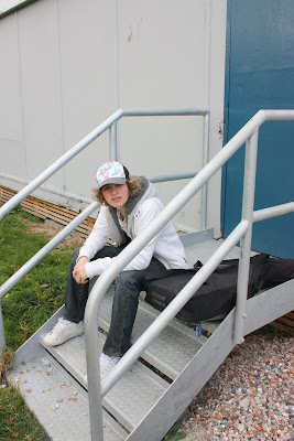
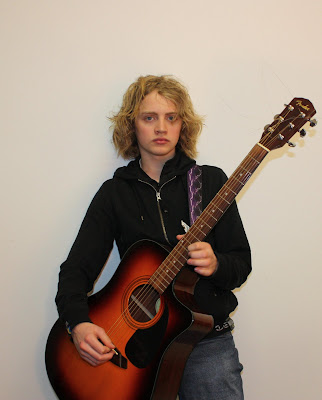
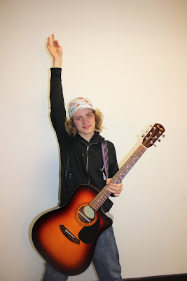
I spent a lot of time looking at and comparing my work to real music magazines. I spent time on the front cover working with fonts and the main image to make it look as realistic and competitive ( in the media industry) as possible. I spent time adjusting little details such as font size and position, sometimes even just very slightly, to make my product as successful as possible. I spent time airbrushing the main image which real magazines do. The cover includes a masthead, which I again spent time changing and looking at different fonts to find the most suited one, plugs and a main image of the artist as the main part of the cover and also a smaller image of another artist featured inside the magazine. I also spent a lot of time working with fonts and position of text while making the contents page to make it look as realistic as possible. In my opinion the contents page uses conventions of real media products as it includes everything a music magazine contents page would. The way I have laid it out also makes it a convention as it is set out like a real magazine contents page would be. The double page spread carries on the idea of the conventions by using relevant font and position of the text and images are similar to that of a real magazine.
How does your media product represent particular social groups?
My media product represents social groups who like rock/indie music as the fonts and colour scheme used reflect this. The fonts have a decayed look to them which is associated with rock music and the colour scheme is also associated with rock music. I know this as I studied other rock/indie music magazines. The artists included in my magazine, such as SUM 41, Pink Floyd and Simple plan also reflect the rock/indie social group who will be reading my magazine. The main artist on the cover reflects the age group as he is 17 years old so this is representing the audience of been possibly at a teenage age. However, Pink Floyd are an older band so this reflects that the magazine is also aimed at slightly older people aswell.
What kind of media institution might distribute your media product and why?
My magazine could be published by Emap, Ipc, Future..any magazine publishers really. It would maybe be more suited to be published by IPC as they publish NME and my magazine has conventions which are similar to NME which suggests they are linked in some way. The main competition for my magazine would then be other music magazines such as Kerrang that are published by other companies. IPC publish many successful magazines including music magazines.
Who would be the audience for your media product and how do you attract/address your audience?
The audience for my music magazine is people aged of both genders from the age around 16 to 23 who like rock/indie music. I show this by the age of the main artist on the front, the type 0f font used (decayed looking/punky) and the colour scheme on the front cover. I also reflect this in the content of the double page spread as I use informal language during the interview and ask the artist questions that people of this age range would possibly ask. I include male and female artists to show that the magazine is aimed at both males and females. I attracted the audience by using bold, bright fonts on the cover and a large image of the main artist which will attract the audience as they will be interested in the artist and the colour scheme and fonts make the magazine stand out in the first place. The competitions and artists on the contents page also address the audience as they will be interested in these things.
What have you learnt about technologies from the process of constructing this product?
I have not really learnt anything new as I was already familiar with the program I used to create my products (Ulead Photo Express) but I have definatley improved my skills. I have improved my photo editing skills (airbrushing) and also learnt how to place fonts in certain places that make the product look attractive. I have learnt that the smallest details make a huge difference.
Looking back at your preliminary task, what do you feel you have learnt in the progression from it to the full product?
My final main task front cover is similar to my preliminary task cover. I used the preliminary task to practise the techniques I already knew in preperation for the main task. I learnt to spend time on the little details like the fonts and colours to make my magazine as effective as possible. I also learnt to study carefully real magazines to get as many ideas as possible for my magazine so I was not stuck for ideas when i created my own.


